fxhash is a Web3 generative art platform where users mint, collect, and trade digital artworks.
As the platform grew, feature expansion outpaced structural clarity. The experience became fragmented, visually inconsistent, and increasingly complex.
Challenge
• Inconsistent UI patterns across pages
• Feature-heavy beta creating cognitive overload
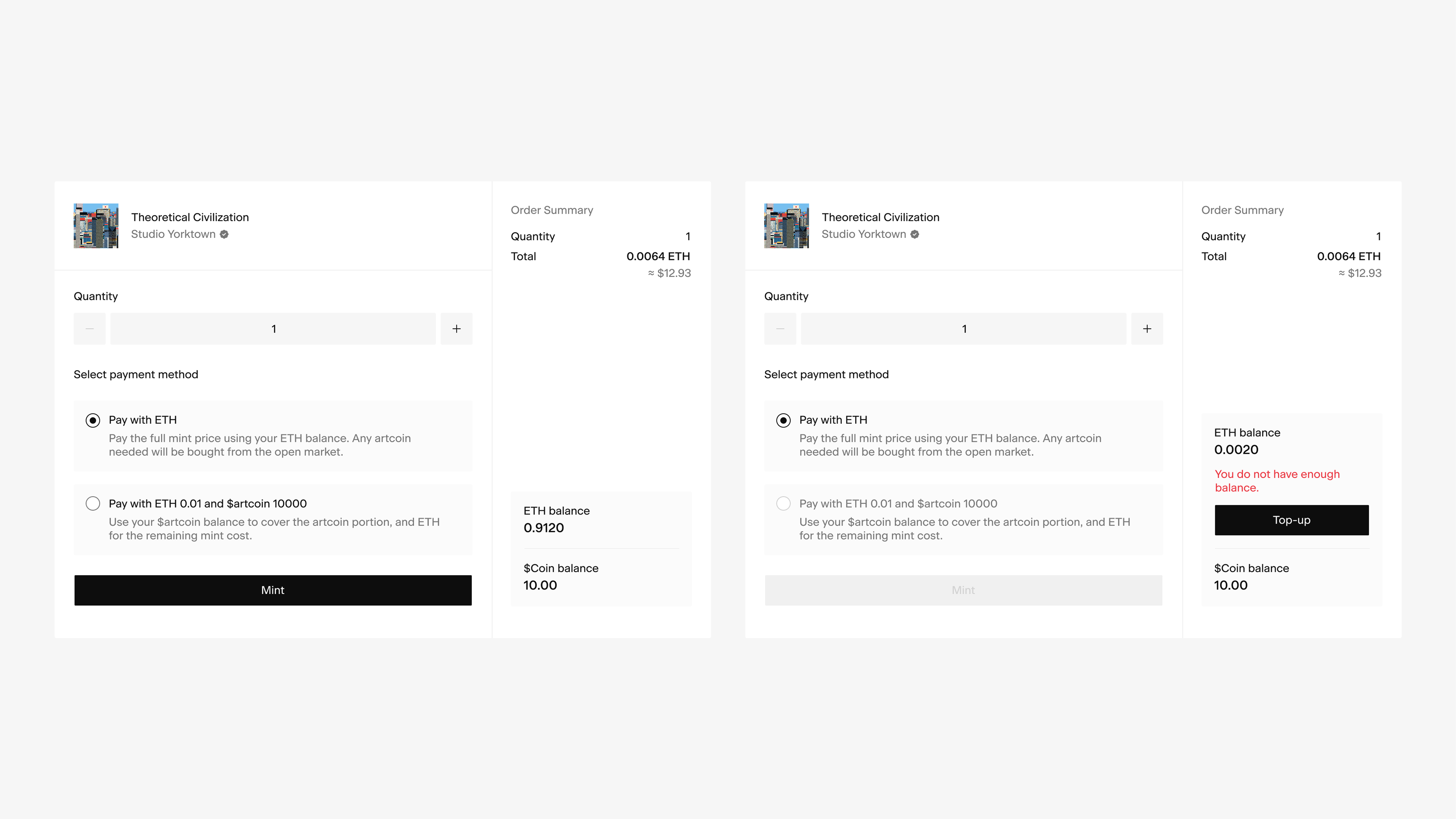
• Complex wallet and transaction states
• Limited system foundation for scale
Structural Redesign
Before visual changes, I focused on system structure. I mapped content hierarchy and feature relationships to clarify:
• Navigation logic
• Component grouping
• Information priority
This grounded decisions in structure rather than surface aesthetics. We then removed redundant pages and consolidated overlapping features — shifting the platform from feature-dense to focused.
Previous Sitmap
New Sitemap
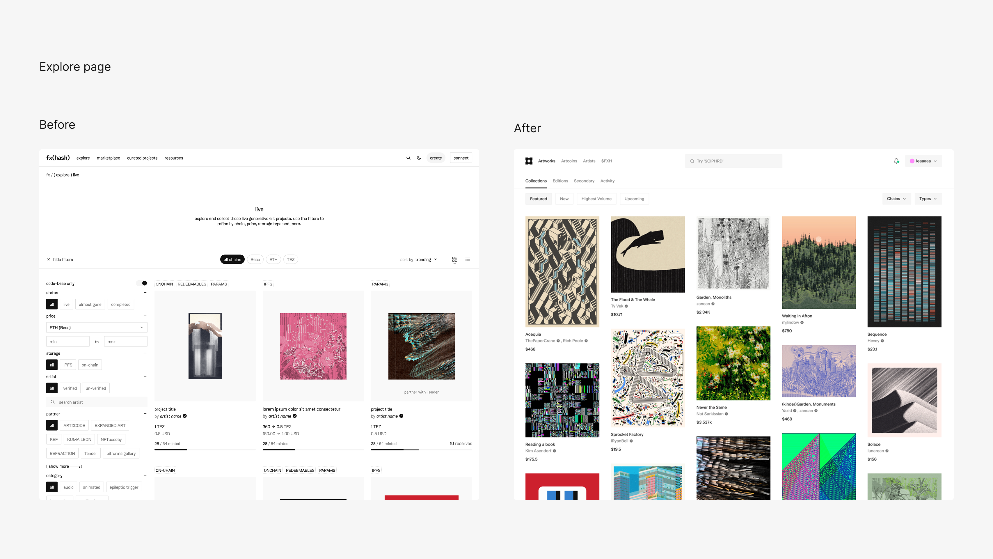
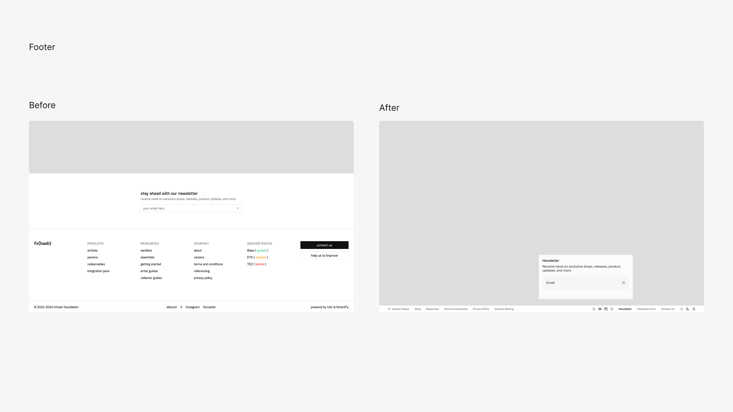
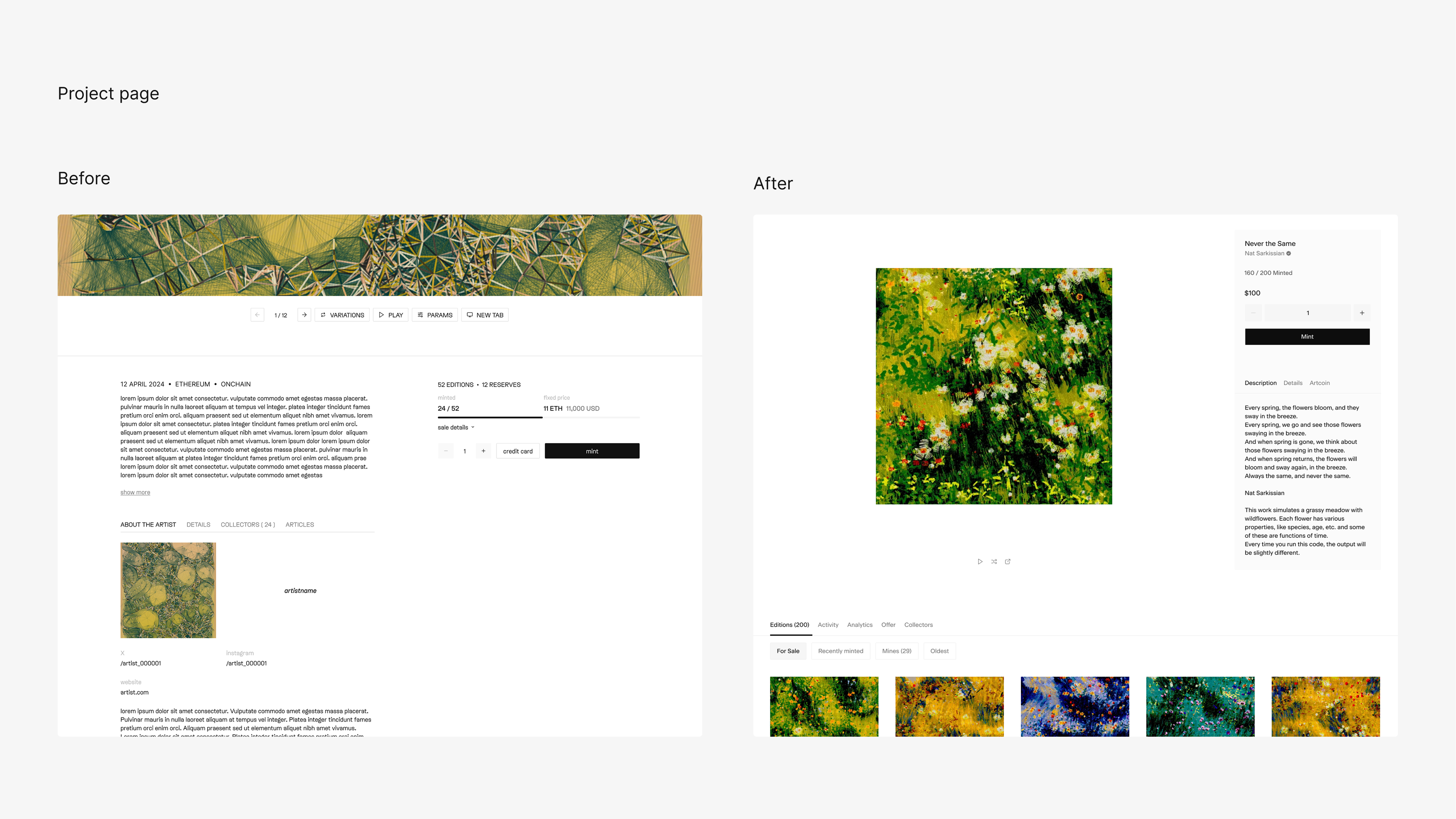
Platform Evolution
Previous interface
• Inconsistent typography and spacing
• Multiple card variations without hierarchy
• Visual clutter
• Too many features added unnecessary complexity.
The interface had become fragmented and heavy.
Beta Version
The beta surfaced more functionality to improve usability. Instead, increased visibility amplified surface complexity. Testing showed that more features did not mean better clarity.
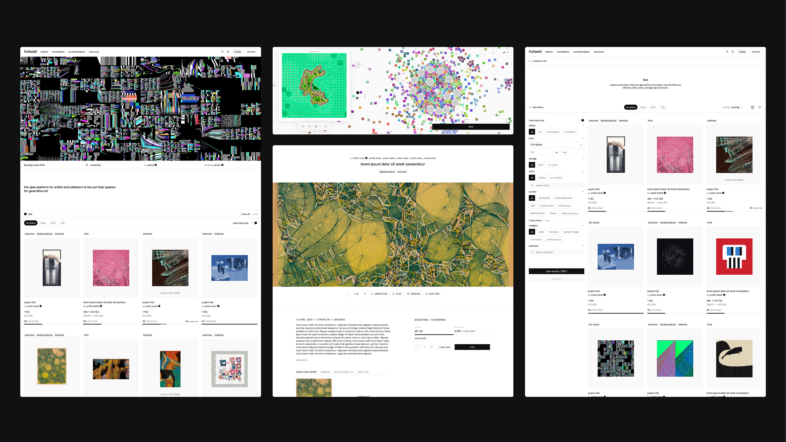
Current Version
The redesign shifted from feature exposure to structural focus.
• Consolidated overlapping functionality
• Removed redundant pages and surfaces
• Shifted non-essential logic into the background
The result: a cleaner, more intentional platform centered on art — with reduced cognitive friction and stronger user confidence.