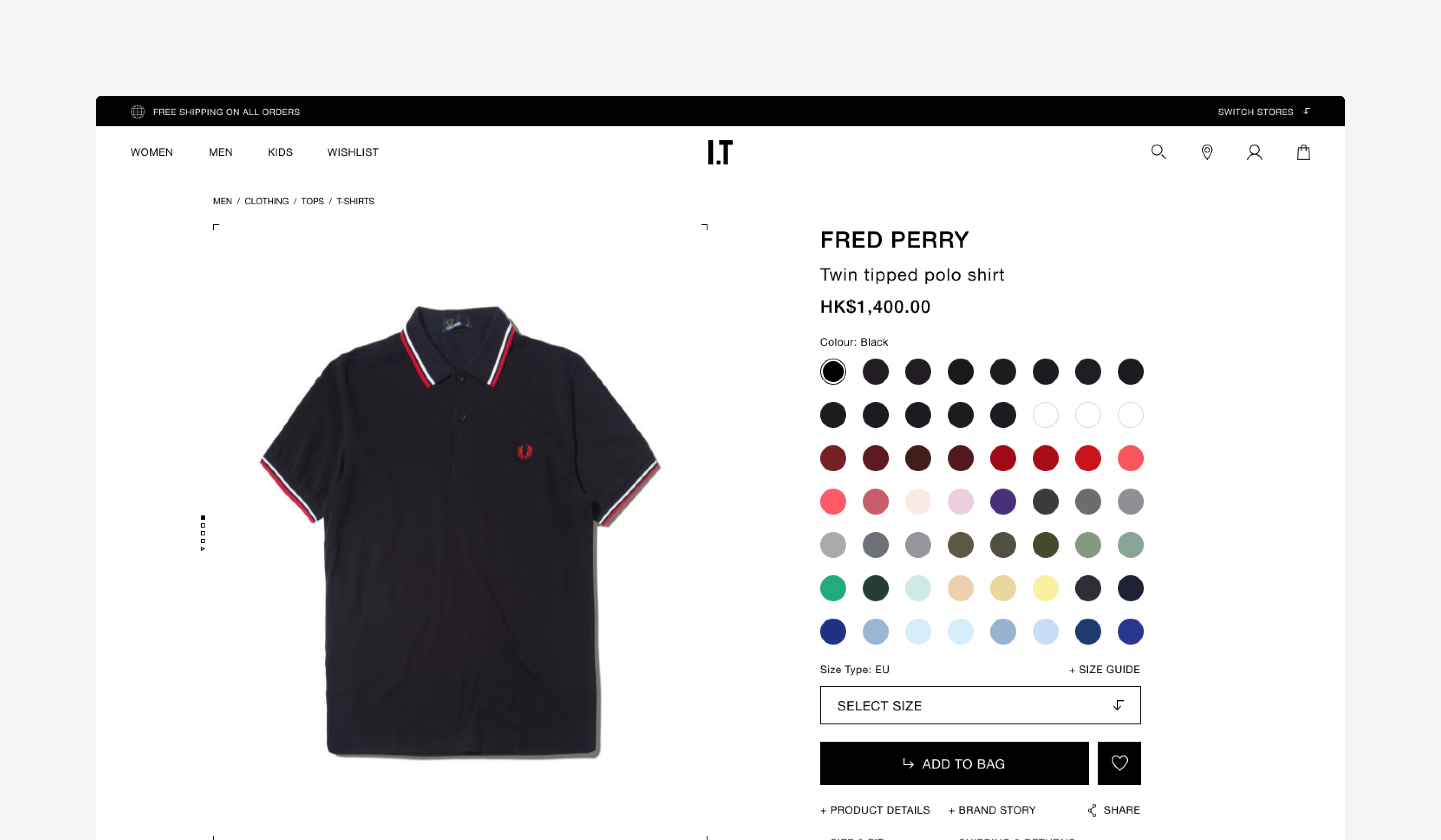
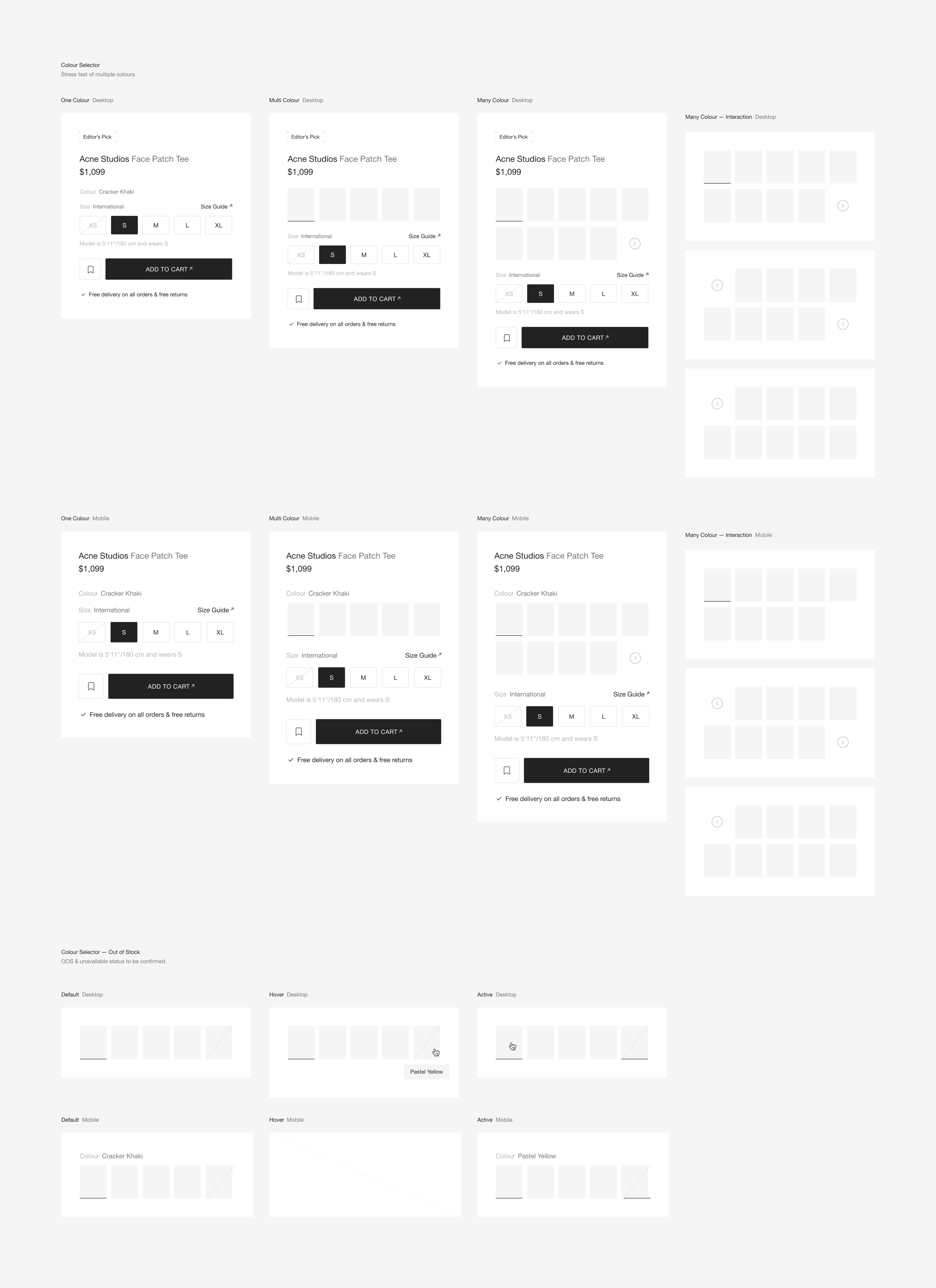
On a multi-brand fashion platform, a single product can offer more than 20 colour variations.
The existing interaction relied on small dot selectors, creating visual clutter and slowing comparison. The experience lacked clarity and consistency across brands.
Previous Design
The previous design relied on small dot-based selectors. Users needed to click through each variation individually to preview colours, making comparison inefficient. Selected states were subtle and often unclear.
Problem
• 20+ variations created visual overload
• Unclear selected states caused hesitation
• Limited visibility of available colours
• Inconsistent behaviour across brands
• Extra steps slowed decision-making
Approach
• User interviews revealed friction when browsing multiple colour variations.
• Competitor research highlighted the effectiveness of image-based previews.
• Through iterative prototyping and usability testing, we refined a solution that allowed users to visually scan all available colours while preserving layout clarity.
User Interview
We interviewed users to understand how they browse and select colour variations. Questions focused on navigation habits, confusion points, and the importance of viewing multiple options before purchase.
Key insights:
• Unclear selection states
• Limited variation visibility
• Visual overload within the product layout
These insights shaped a clearer and more efficient variation system.
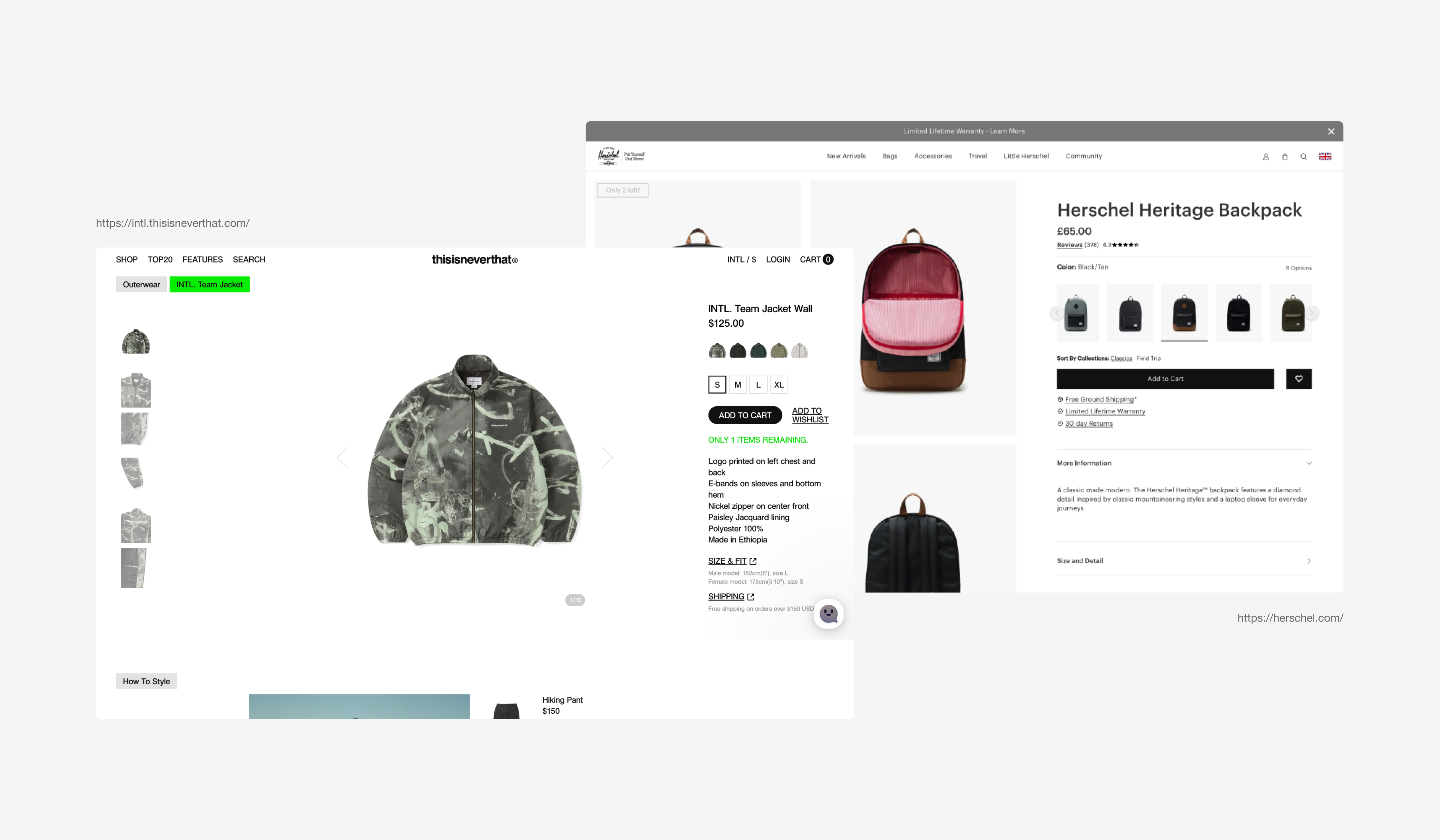
Competitor Research
We identified image-based previews as a widely adopted solution for colour variations. This enabled users to compare options at a glance, removing unnecessary interaction steps.
With these insights, we redesigned the variation system to improve clarity and scalability.
What We Did
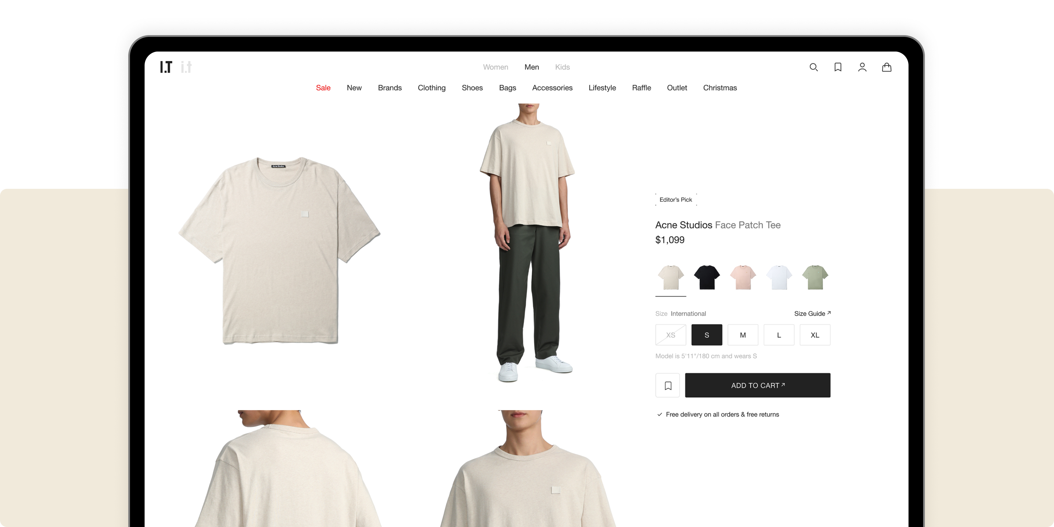
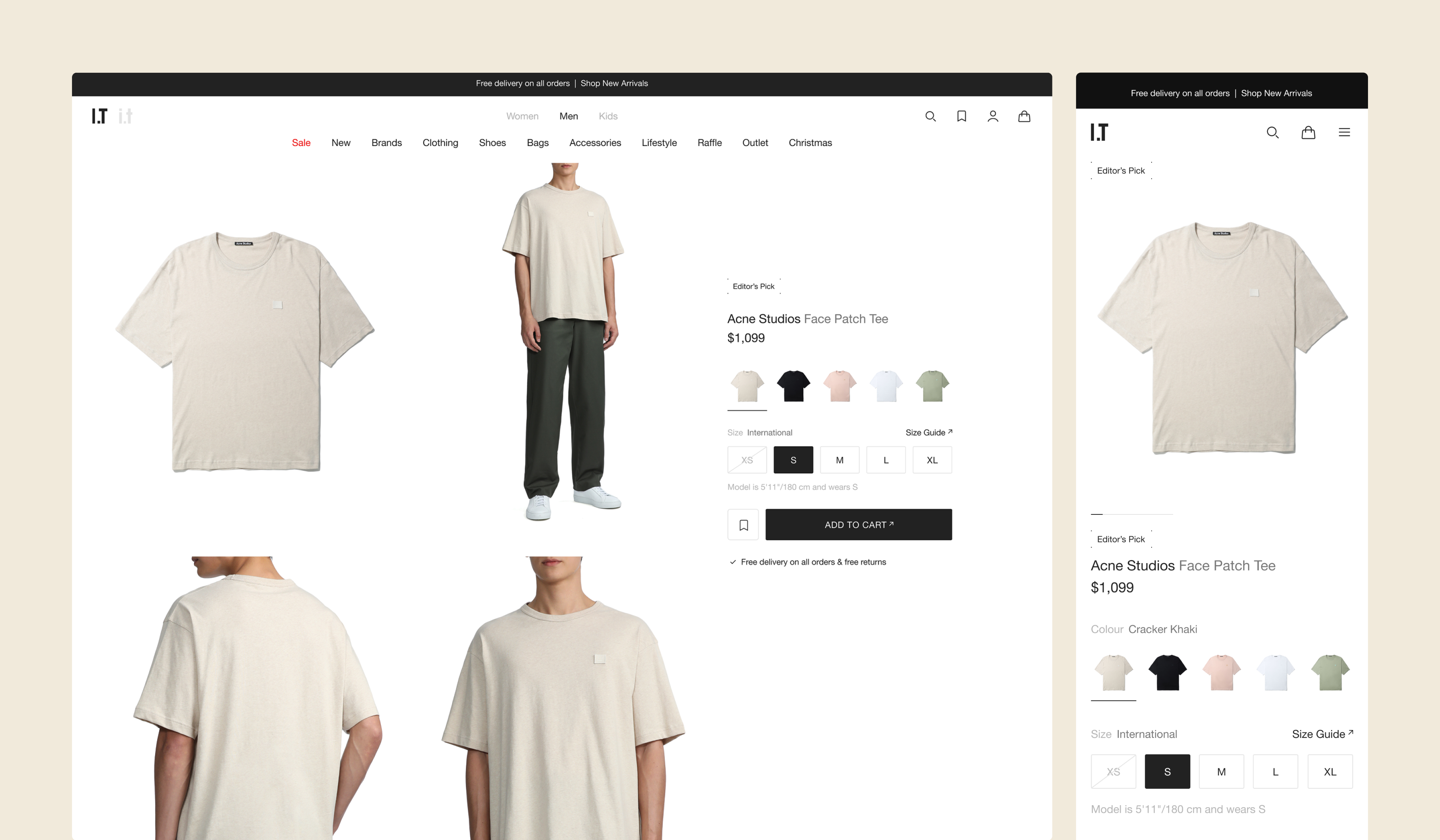
→ Replaced the dot-based selector with image-based previews
→ Strengthened selected states to provide clearer visual feedback
→ Reduced layout density
→ Tested and iterated with users
→ Standardized the component for cross-brand implementation
Impact
The redesigned variation system made browsing more intuitive and visually clear.
Users could scan and compare options at a glance, reducing hesitation during product exploration.
The standardized component improved consistency across brands and simplified future implementation.